
Canal+
How do you convey the breakneck intensity of motorsports and roar of the engines with a typeface?
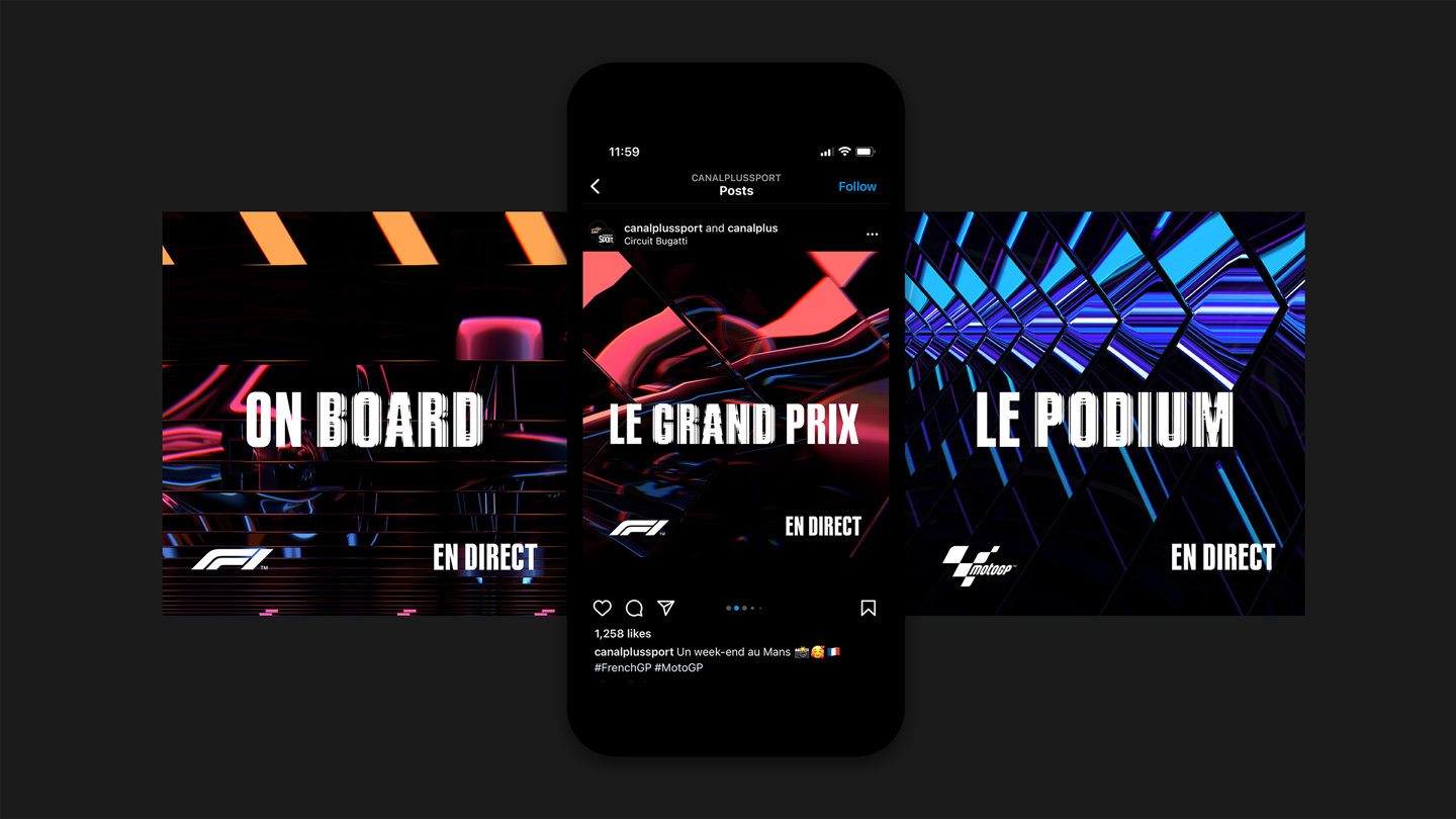
We created a bespoke variable typeface as part of a suite of brand assets for motorsports coverage on Canal+. It has a multi-sensory creative approach that brings the thrill of the race track to viewers of F1, F2 and F3 and MotoGP.
Background
At the racetrack, the Doppler Effect’s intense sonic peaks trigger heightened emotional activity known as the human galvanic skin response.
Electrical current flows more readily through the body, throughout the crowd, making the atmosphere literally more electric.
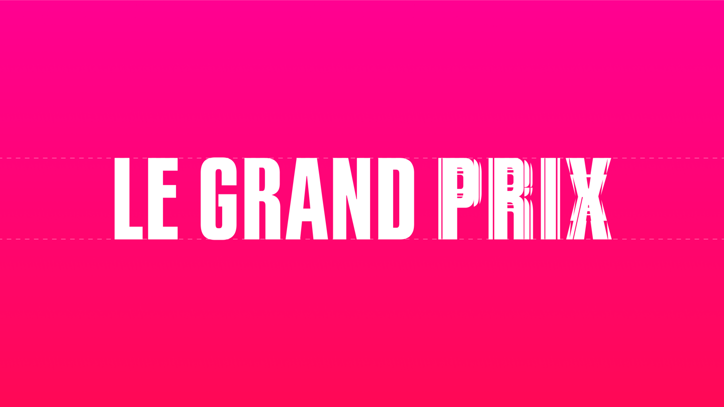
The Canal+ motorsports typeface is designed to visualise this intense sensorial experience.

Construction
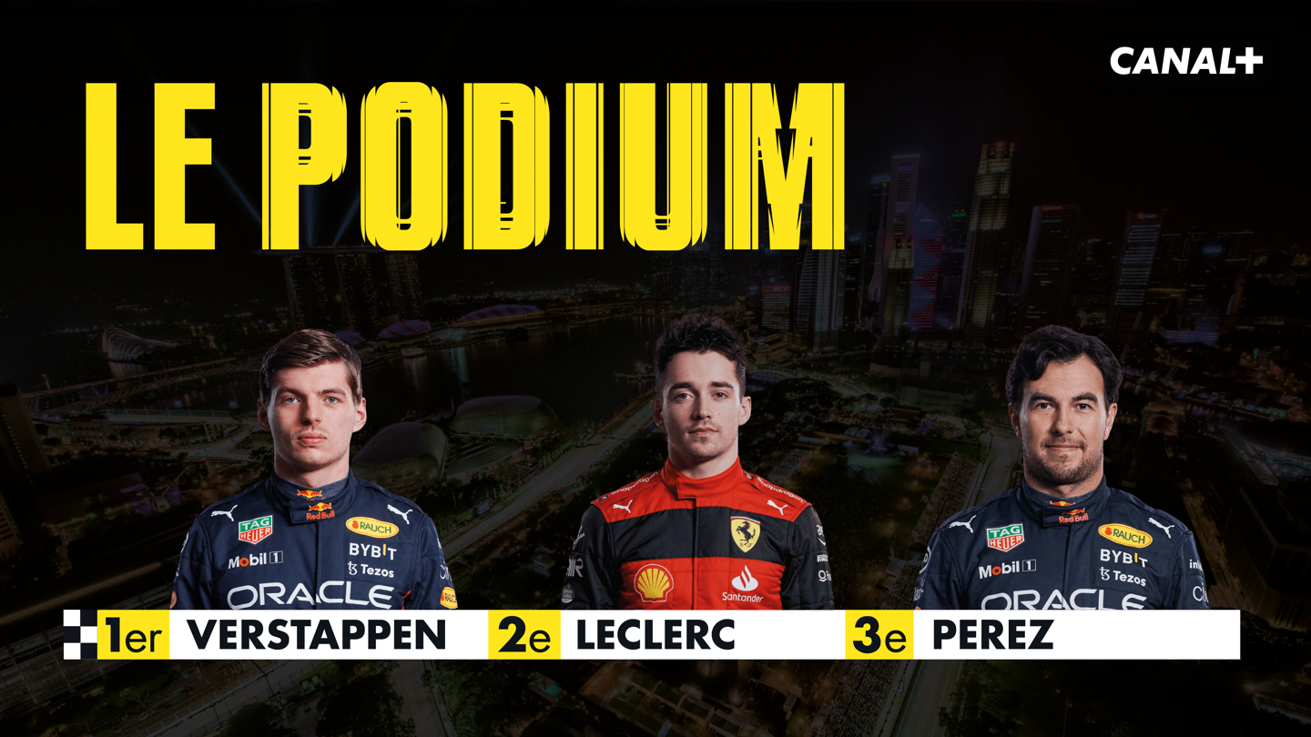
The typeface design is inspired by mid-century motorsports print design. Bold, sporty, tough, and built with the practicality of on-screen use in mind, it allows for more characters per line when used to introduce drivers and race information on title cards. It follows a modern interpretation of simple sign painter’s lettering styles for a clean and clear look that feels energetic.
We used variable font technology to introduce the tension of the Doppler Effect by gradually breaking each letter apart in a way that feels chaotic and vibrational. This allows Canal+ to turn up the volume on graphics – so when the race is further away, the clean typestyle can be used, but when the cars are on the grid, they can visually demonstrate the tension and excitement of the race by embracing the full volume of the Doppler Effect.


More case studies
Own your own words.
Let’s talk typefacesNeed more information? Here’s how it works