
Nederlandse Publieke Omroep
How do you create a unified typographic brand style whilst allowing very different broadcasting styles to express themselves?
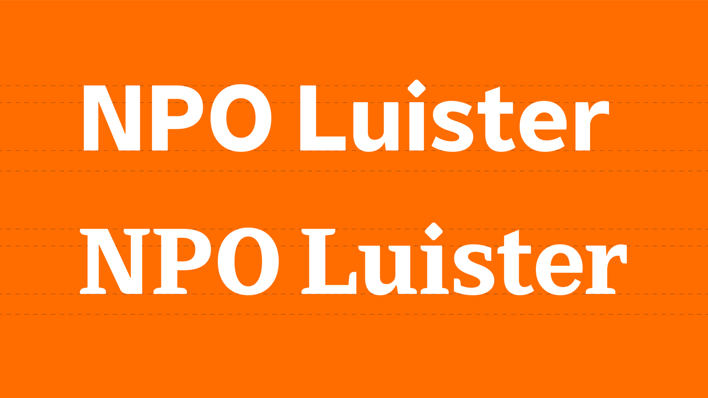
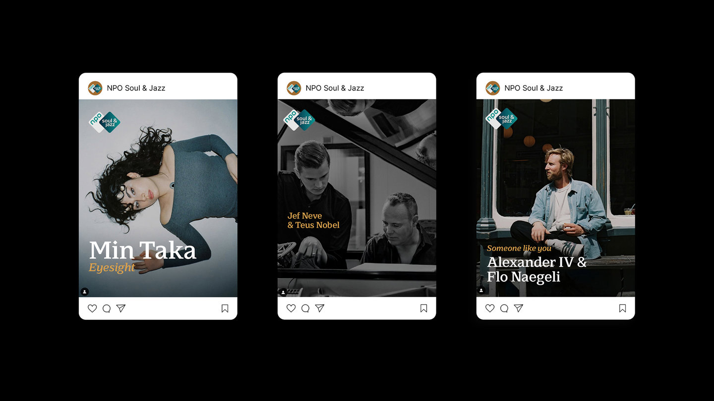
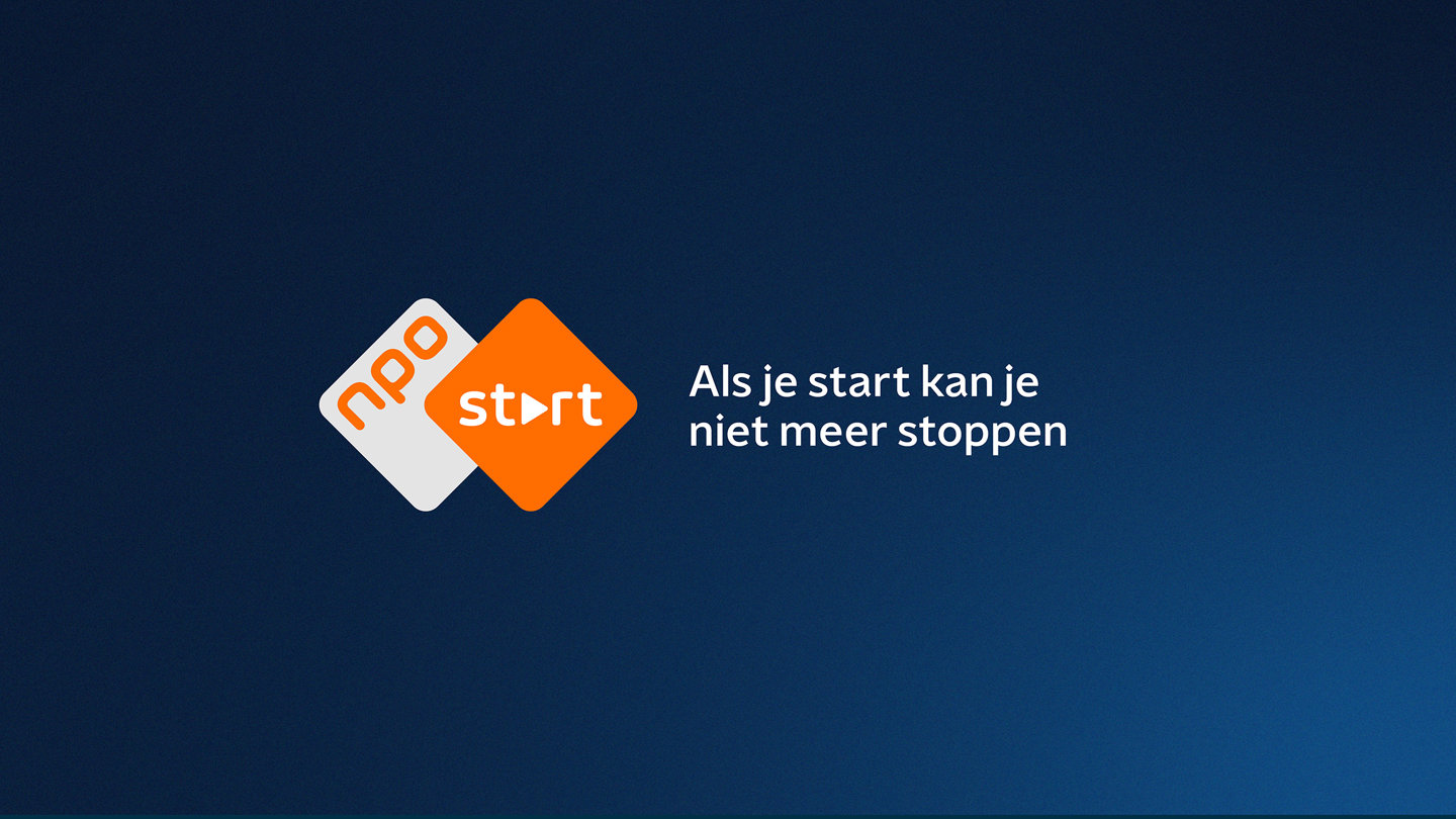
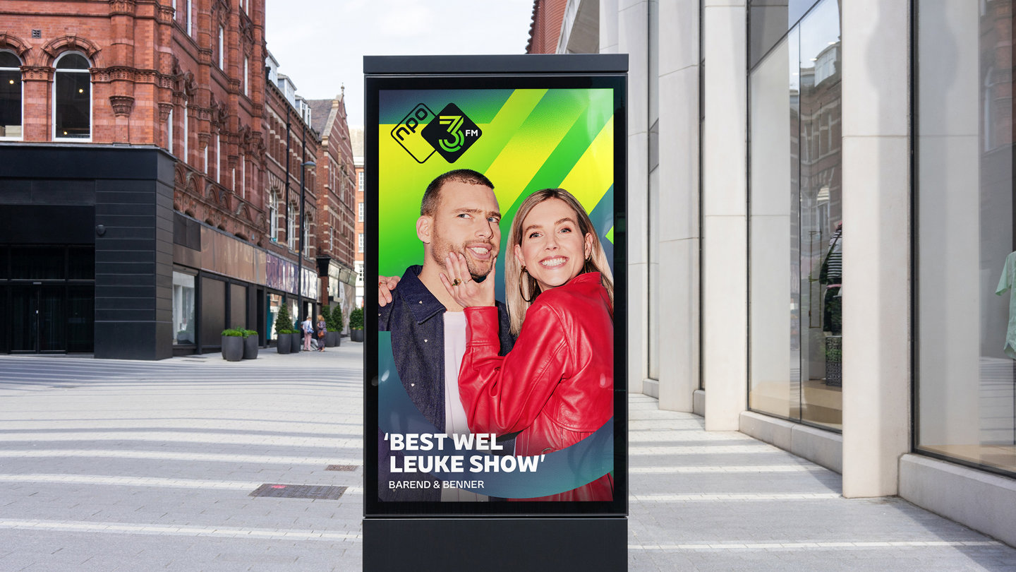
Our ‘superfamily’ of fonts for Dutch Public Broadcaster, NPO, allows sans-serifs and serifs to be used interchangeably without compromising the brand style, creating freedom for each brand to convey its individuality.
Background
The NPO is responsible for popular TV channels and radio stations across the Netherlands.
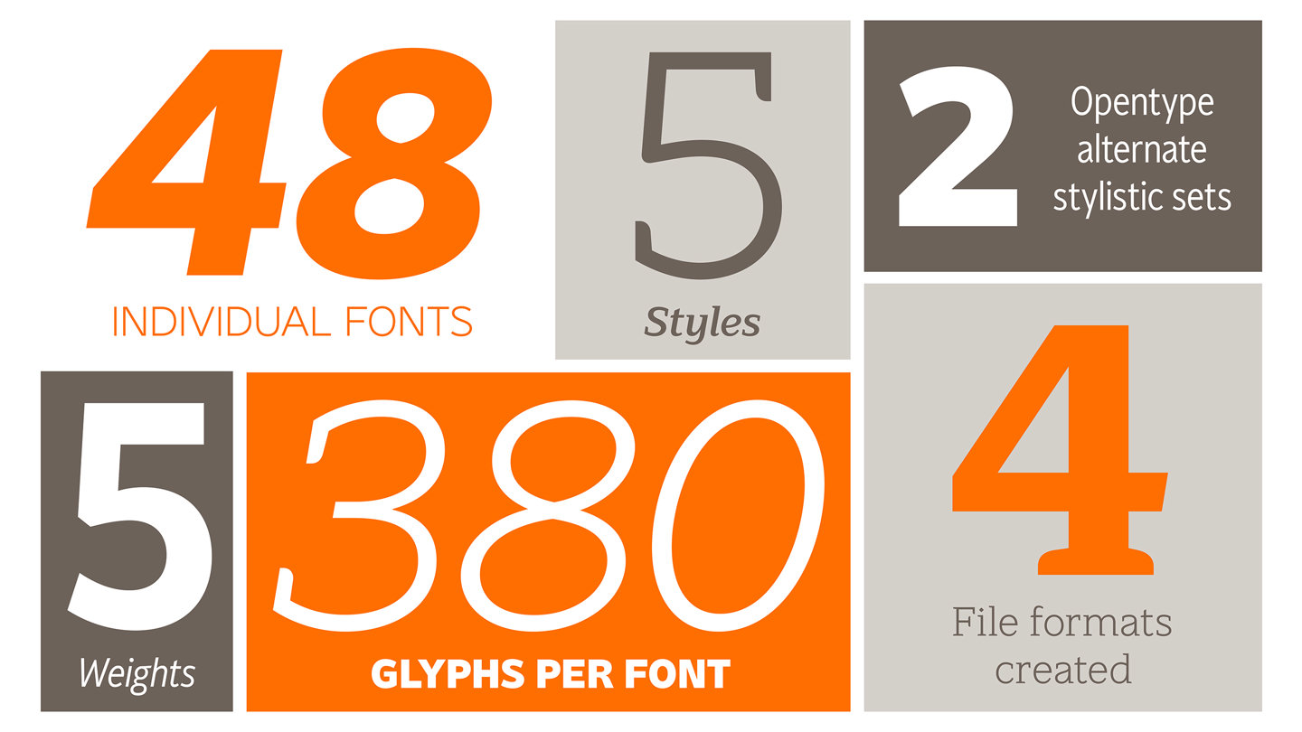
With an extensive portfolio of sub-brands and channels, over time, each channel had developed its own collection of typefaces in use, and as such, was incurring significant annual fees in font licensing.
CONSTRUCTION
The concept behind the design was to create a clean, contemporary, and easy-to-read family that would address the variety of needs across NPO’s diverse portfolio.
We designed with legibility as our main priority, knowing that the primary home for this new family would be on screens, so individual letter distinction was key.
We used a humanist style, which has its roots in calligraphic forms, to ensure that each letter has clear features, while still working in harmony with the full letterset.
Large counters and open apertures added to the clarity upon font reduction, and a slightly narrower set of proportions ensured we could use more characters per line, to help avoid eye fatigue when reading larger blocks of copy.

In Application
We created a harmonious look that allows for an infinite amount of complementary matching between fonts, and lots of freedom for each brand to convey its individuality.


Martine Bannink, Brand & Design Manager, NPO
The process of creating a typeface family for Nederlandse Publieke Omroep was really collaborative. As a result, we achieved a fine product that also enabled the required differentiation within our total brand portfolio.”More case studies
Own your own words.
Let’s talk typefacesNeed more information? Here’s how it works