
Benromach
How do you convey the dedicated craft that goes into a fully handmade whisky brand whilst helping position them for a new generation of consumers?
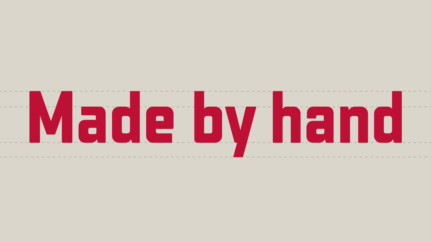
Benromach’s brand typeface is based on original sign painter’s art, and uses modern techniques to give it an organic edge so that each block of copy has a human feel.
BACKGROUND
Our new Benromach wordmarque derives from the brand’s history, with the original hand-painted lettering from the distillery’s pagoda-style roof providing the inspiration for the new logotype.
Each character was hand-drawn and then digitised to create a new typeface with full language support to ensure consistent use across all communications.


CONSTRUCTION
To mimic a sign painter’s art, we designed a full range of alternate characters with slightly different proportions so that each block of type feels more hand-drawn and organic. The typeface automatically selects these characters as text is set to ensure each slug of copy is unique.

In Application
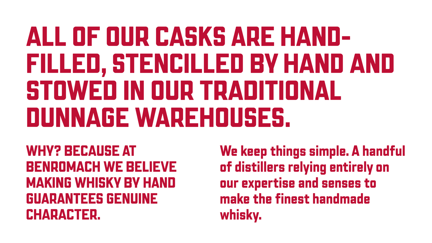
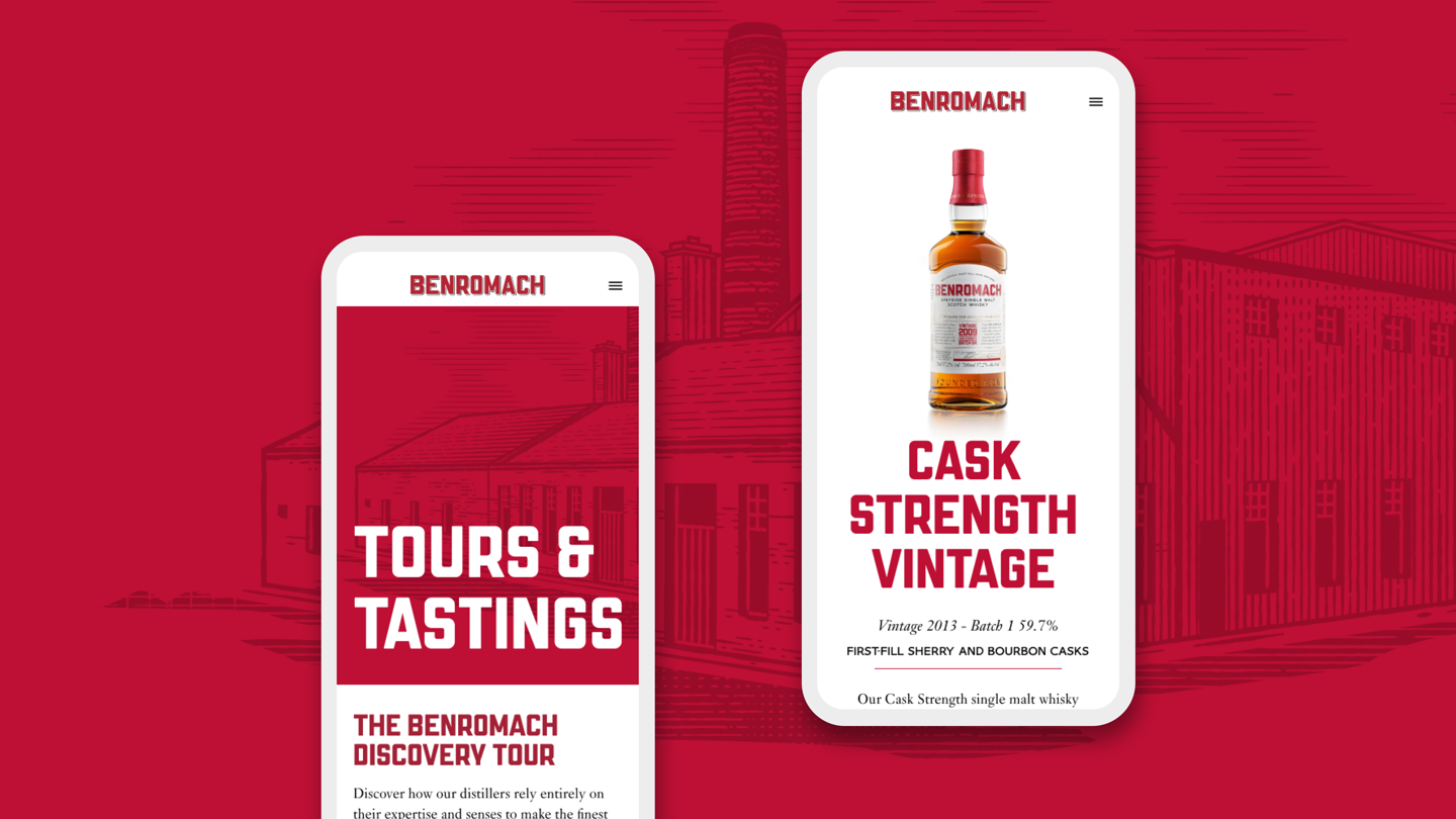
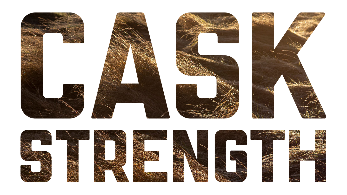
The typeface is the bedrock of all Benromach communications, used boldly on everything from packaging and printed comms to digital and retail environments. The bold, red gas pipe lettering is the visual shorthand for the brand. Made by hand for genuine character.

More case studies
Own your own words.
Let’s talk typefacesNeed more information? Here’s how it works