
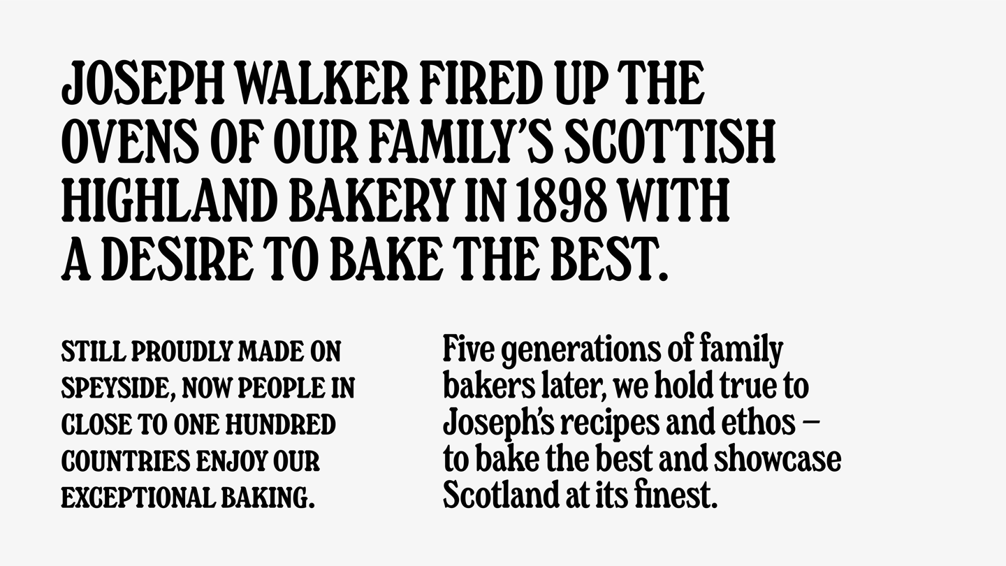
Walker’s Shortbread
How do you modernise a brand whilst honouring five generations of family heritage?
To fully communicate the depth of the Walker’s story on pack and in their wider communications, we created a typeface that drew on their origins, modernising their look and paying homage to the past.

BACKGROUND
The design took inspiration from hand-painted signage found on one of Walker’s original delivery vehicles that we discovered whilst delving into the family archives.


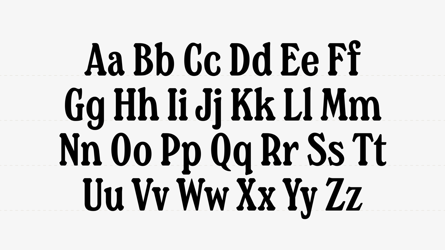
CONSTRUCTION
We used the original signage as reference and updated it to create a cleaner and more legible version that would work in modern applications, taking care to retain the stylistic features that let the heritage feel shine through.

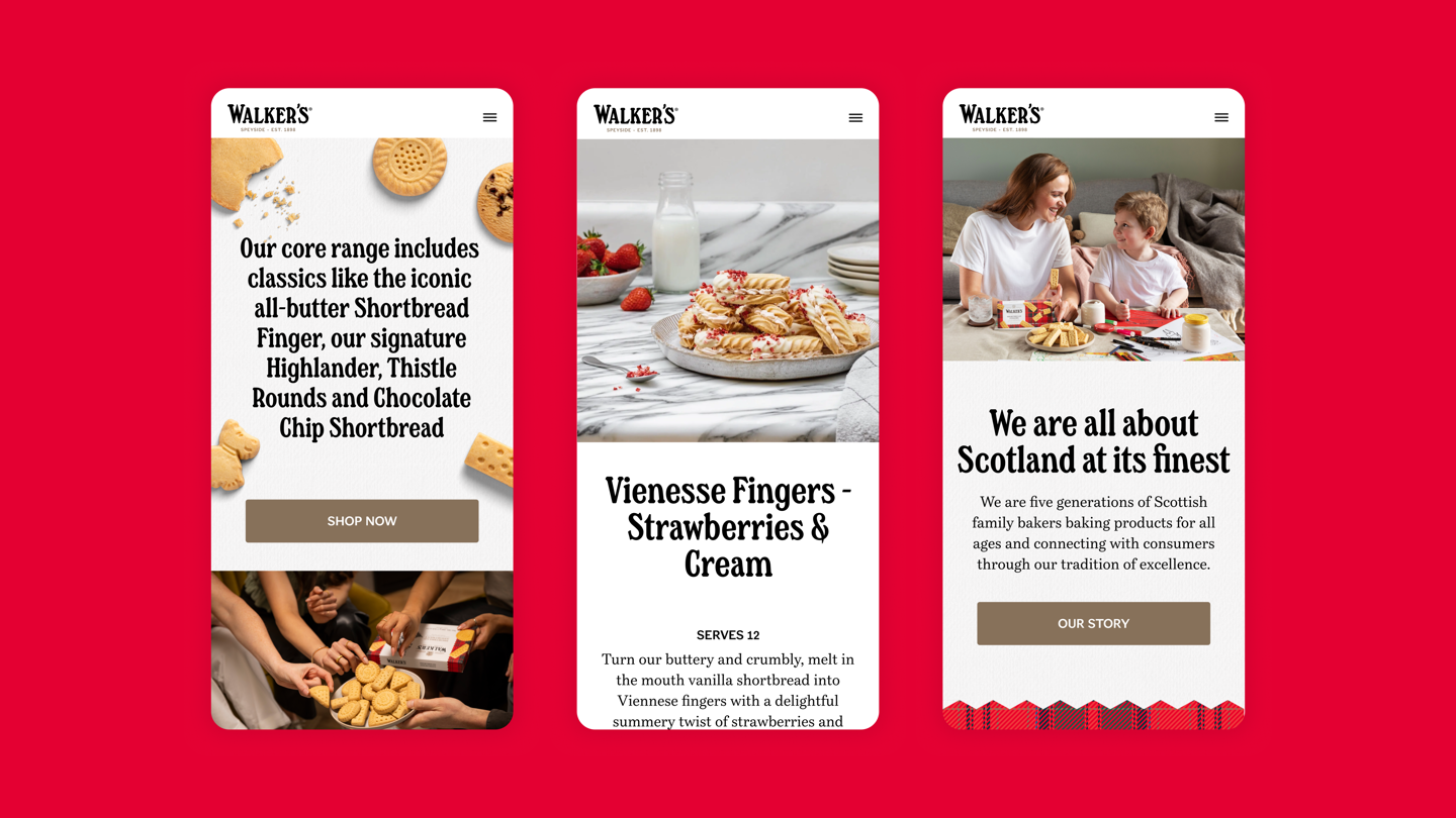
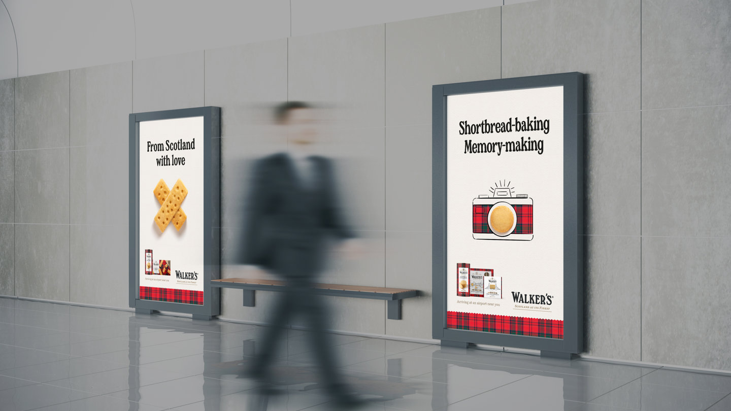
In Application
The comprehensive range of characters and alternates allows the designer to craft headlines individually, making sure each one is carefully considered and appropriate for every touchpoint.


Sarah Macaulay, Head of Marketing, Walker’s Shortbread
Fundamental in our brand’s evolution, from strategy to design application on-pack and across our marketing activity.”More case studies


Own your own words.
Let’s talk typefacesNeed more information? Here’s how it works